Programmer’s Guide


| IMSL C# Chart Programmer’s Guide | Quality Control and Improvement Charts |
|
Quality Control and Improvement Charts
Introduction
Quality improvement charts have a variety of uses. In this library the charts are organized into three broad groups: Shewhart control charts, other control charts and process improvement charts. The Shewhart control charts were originally described by the statistician Dr. Walter A. Shewhart (1931). Since this early work, other charts have been developed for engineering and management analysis of processes. In the 1980s customized charts were developed for other retrospective analysis of quality management data.
Shewhart Charts
While working for Western Electric in the 1920s, Dr. Shewhart developed a general, practical approach to statistical monitoring of manufacturing processes. He advised managers on implementing these within Western Electric and later published his work in Shewhart (Montgomery, 1931). All Shewhart control charts share several characteristics in common. First, the horizontal axis represents time or lot sequence, but they all have different vertical axes, depending upon the chart time.
Next, all Shewhart control charts have a center line that is drawn parallel to the time axis. This typically represents the mean of the process, but the value of the process mean can vary depending upon which data are first used to design the chart. In some cases it will be the mean of the data plotted, in others it could be the mean calculated from a much larger number of measurements on the historical operation of the process.
Lastly, all Shewhart control charts have lines drawn to represent either the upper or lower control limits. In most cases both control lines are present, in others where the data have a natural bound, such as zero, only one of these control limits might be drawn.
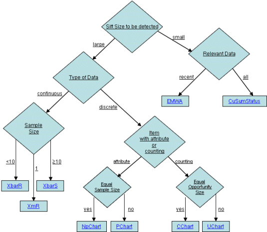
Shewhart control charts are also broadly classified into two groups: variable and
attribute data. Variables control charts are used when the quality of interest is a
continuous variable, such as the diameter of a valve. If w is a continuous measure
of a quality of interest, with mean  and within-sample standard deviation
  , then the center line is at
  and the upper and lower controls limits are at
  Typically k=3 and the charts are called 3-sigma control charts.
Attribute control charts are used when qualities, not quantities are measured. For example, items may be characterized as conforming or nonconforming to a specification. Items may also be characterized as defective or nondefective. Examples of attributes include the number of failures in a manufacturing run or the number of defects on a computer chip wafer.
When the number of defective or nondefective items are plotted then a PChart or
an NpChart are generally used to describe the non-comformity data. The
NpChart is used to plot the number of defects when all of the sample sizes are
equal, and the PChart is used when the sample sizes are unequal.
If a single item can have multiple defects then a CChart or UChart is used,
depending upon whether the area inspected for defect is consistent or varying. An
example of multiple defects per item would be the count of the number of scratches
on mirrors. If all samples have an equal opportunity for defects use CChart, otherwise
use UChart. So to monitor the number of scratches on mirrors use
CChart when all mirrors being made are the same size and use UChart for mirrors
being made that are sized differently.
In IMSL C# the ShewhartControlChart class is the base of a number of
classes; it is not usually used by itself. Most of the charts in this chapter extend
ShewhartControlChart.
The following diagram can be used to determine the appropriate control chart to be used in a given situation.
Variables Control Charts:
XbarR estimates  and
and  using the ranges of the samples. It is best used
when the sample size of a continuous variable is between 2 and 10.
using the ranges of the samples. It is best used
when the sample size of a continuous variable is between 2 and 10.
RChart plots the sample ranges. It is typically used in conjunction with
XbarR.
XbarS estimates  and
and  using the means and standard deviations of the
samples. It is best used when the sample size of a continuous variable is at least
10.
using the means and standard deviations of the
samples. It is best used when the sample size of a continuous variable is at least
10.
SChart plots the sample standard deviations. It is typically used in conjunction
with XbarS.
XmR is a moving range chart. It is used when the sample size of a continuous
variable is one.
EWMA (Exponentially Weighted Moving-Average) plots weighted moving
average values. It is used when the sample size of a continuous variable is one.
Attribute Control Charts:
NpChart plots the number of defects. It is used when defects are not rare.
PChart plots the rate of defects. It is used when defects are not rare.
CChart plots the defect count. It is used when defects are rare.
UChart plots the rate of defects. It is used when defects are rare.
Other Control Charts
The CuSum and CuSumStatus charts are more efficient than Shewhart charts
at detecting small shifts in the process mean because the plot represents the moving
average of the cumulative differences between the process and its target
(centerline).
Cumulative Probability
Cumulative probability charts are used if the defect rate is so small that there will be long runs when the number of defects is zero.
Process Improvement Charts
Pareto Chart
Pareto charts are used to analyze the root cause of process defects. They are
based on the “Pareto Principal” which claims that 80% of the defects are caused by
only 20% of the defect categories
Pareto charts resemble bar charts but are different. In a Pareto chart, the defect
category with the largest number of defects always appear as the first and tallest bar
on the chart. The other bars represent the remaining defect categories in descending
order of magnitude.
| © Visual Numerics, Inc. All rights reserved. |
|